
From branding to websites, I’ll help your business look sharper, connect deeper and attract the right people.
Finding Your New Normal
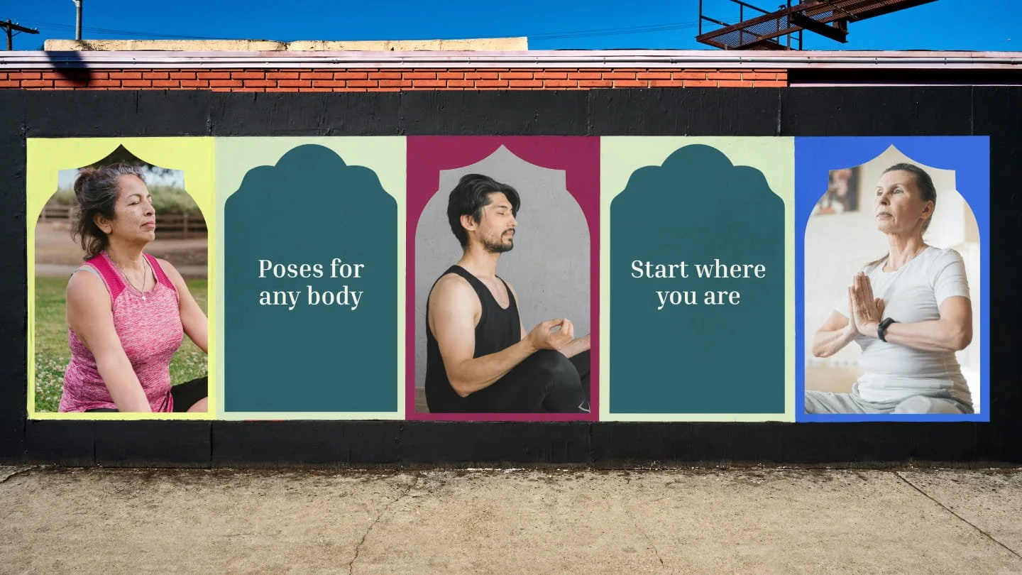
BRAND IDENTITY AND WEBSITE After surviving six strokes and a brain injury, Nikki understands what it means to rebuild life around a new reality. Finding Your New Normal was born from that experience - a space rooted in compassion, resilience, and the belief that movement should be accessible to everyone.
Piers Park Sailing Center
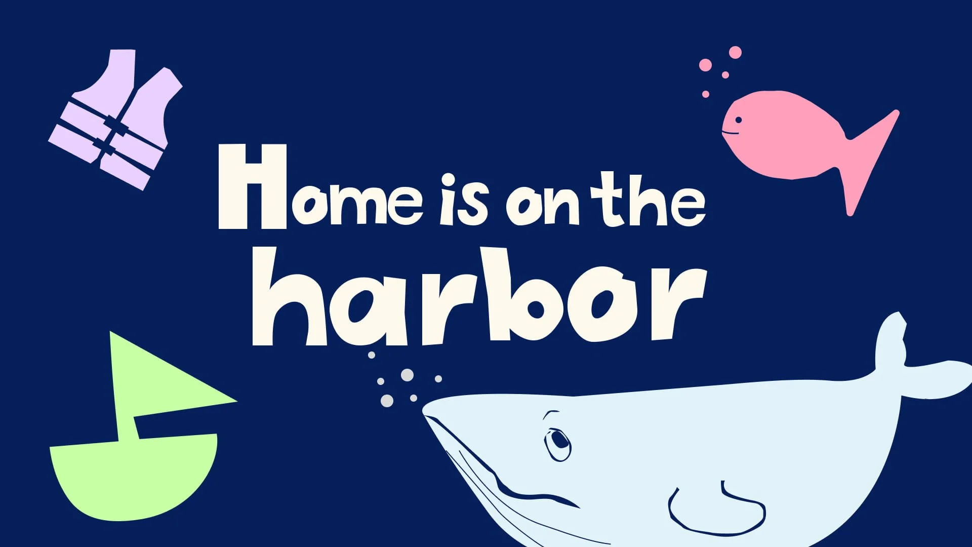
BRAND IDENTITY AND WEBSITEA community-built brand anchored in inclusion, accessibility and belonging. Young participants and teen staff took part in the branding process so they could contribute custom fonts, artwork and ideas that shaped the identity of their second home on the harbor.
Drift & Design Coaching

BRAND IDENTITYWe built a brand that matched their mindset: bold, imperfect, and full of momentum. The new visual identity was inspired by what Drift & Design stands for: creative freedom, messy action, and doing things on your own terms.
Now, their brand gives them the confidence to show up and grow into the next phase of their business with their dream clients.
Loop domestic heat pump suppliers
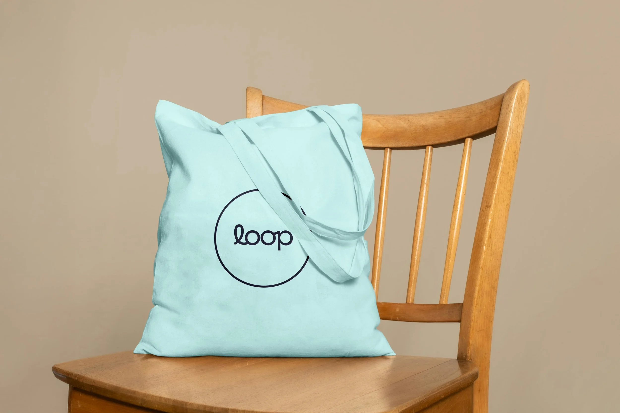
BRAND AND CAMPAIGNSay hello to Loop 👋🏼
A brand that’s here to make sense of heat pumps - what they do, why they matter, and how they can help us heat our homes more sustainably.
Speaker slides for Ricardo Vazquez, design director

VISUAL IDENTITY AND PRESENTATION SLIDE DESIGNI designed the slides for Ricardo’s talk that challenges the idea that “quality” is just a design concern and “performance” belongs to engineering.
Ricardo came to me with a clear goal: no more cobbled-together slides. He wanted a deck that looked as sharp and professional as the content of the speakers sharing the stage with him at Figma’s annual conference.
The Blank Page Project

BRAND AND CAMPAIGNA campaign for Suffolk Libraries inviting teenagers to explore their creativity through free workshops in writing, art and performance. We built a bold, expressive identity that turned blank pages into open invitations — encouraging young people to show up, speak out, and start creating!
Speaker slides for Candi Williams, design director

VISUAL IDENTITY AND PRESENTATION SLIDE DESIGNI designed the slides for Candi’s keynote at Config, Word to the Words, which calls out the outdated idea that content is just the cherry on top of a polished product - instead, she showed it’s a core part of great design.
Kinesthetica Coaching

BRAND AND DIGITAL DESIGNBold, unapologetic, and built to stand out, just like its founder, Amelia. I created a brand identity that refuses to blend in and a strategy that speaks directly to those ready to do the work. The result is a brand that’s as daring as the people it’s made for.
Devular technology consultants

BRAND AND DIGITAL DESIGNWith big-league clients and even bigger ideas, Devular needed a brand that speaks for itself, without saying too much (thanks, Non Disclosure Agreements). I designed a sharp, understated identity, paired with a sleek website that shows their expertise without breaking contracts.
Ashore remote stays

SUB-BRANDING AND WEBSITE DESIGNI built a fresh sub-brand to help Ashore speak directly to businesses that know focus is everything. With a sharp identity and a new website experience that makes booking seamless, Ashore’s new offering is set to change the game for remote working.
Suffolk Libraries
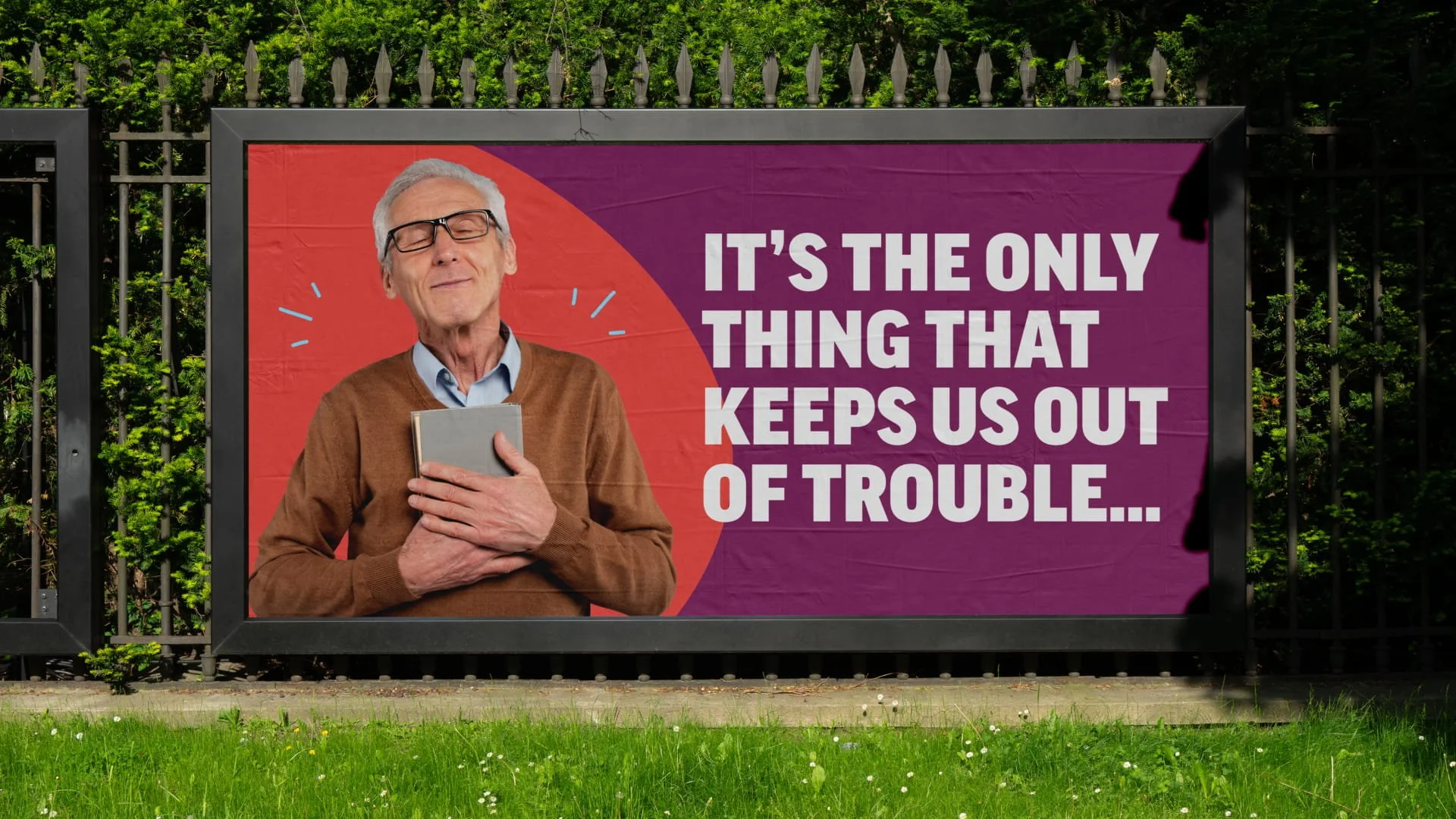
CAMPAIGN CONCEPT AND VISUAL IDENTITYForget the hush-hush stereotypes. Suffolk Libraries is alive with ideas, events, and unexpected moments. I came up with a playful, eye-catching campaign to shake things up and get people through the doors.Trust me, what happens in the library is way more fun than you think.
Testimonials
-
![A smiling man with dark curly hair and a beard, wearing a patterned shirt, against a dark background.]()
Andy Laithwaite, Founder of Actor Inside
“Lauren just help us relaunch Actor Inside and I couldn't recommend her more. The process was beyond smooth, and her design suggestions were really exciting - they showed a deep understanding of our identity, and where we wanted to go next. I'm over the moon with the result.”
-
![A man with curly dark hair wearing a brown zip-up sweater, sitting indoors with plants and a wooden wall in the background.]()
Aled Jones, CEO and Founder of Ashore
“Lauren has a sharp design sense, delivers work quickly, and consistently brings fresh ideas that challenge our thinking and push things forward.
If you want someone who blends creativity with practicality and consistently delivers results that matter, Lauren’s the designer you want.” -
![Woman with wavy dark hair smiling outdoors with green trees in the background.]()
Amelia Sabwerwal, Founder of Kinesthetica Coaching
"Lauren has been my trusted advisor, my editor, my challenger, my cheerleader the whole way through. She is super talented and just 'got me'. She took the time to get to know me and my business, she gently guided me through the unknown territories of this work and we formed a great collaborative relationship; able to discuss, feedback with honestly and challenge each other to push the level higher. "”


