CLIENTSERVICESBrand strategy, messaging, creative direction, website & digital design.
A project anchored (hehe) in inclusion, accessibility, and making everyone feel welcome on the water.
And what better way to build an inclusive brand than involving the community itself?
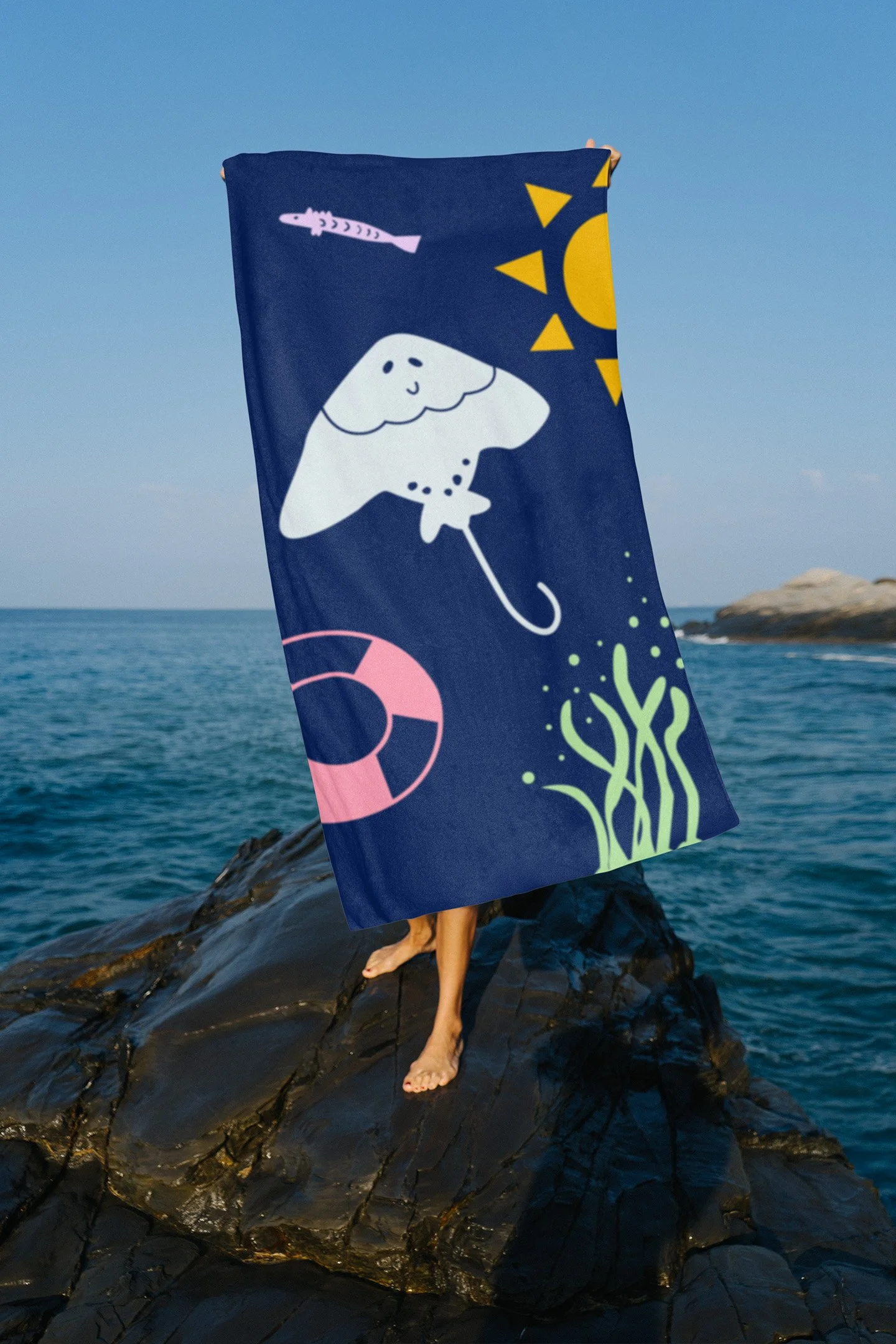
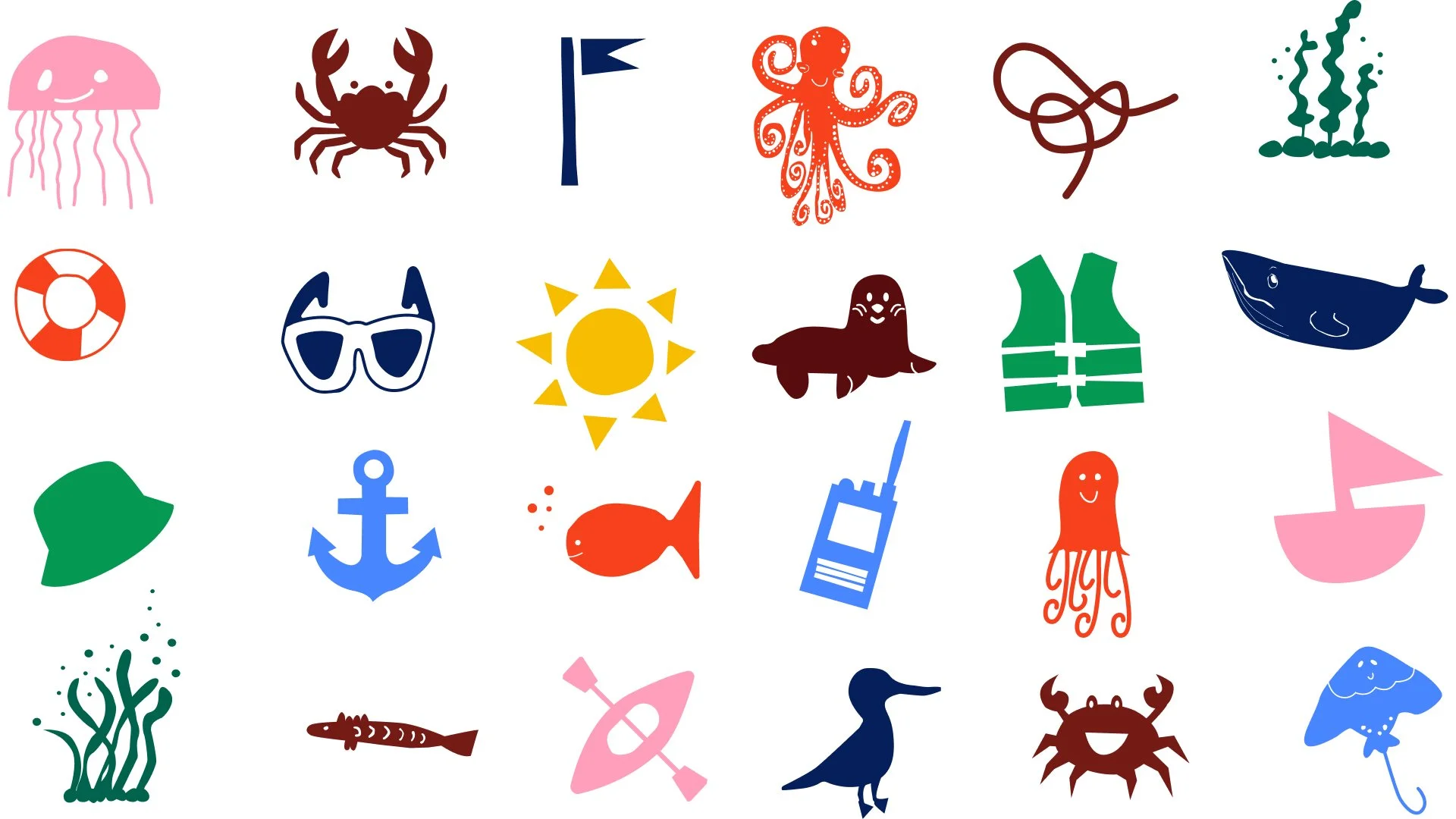
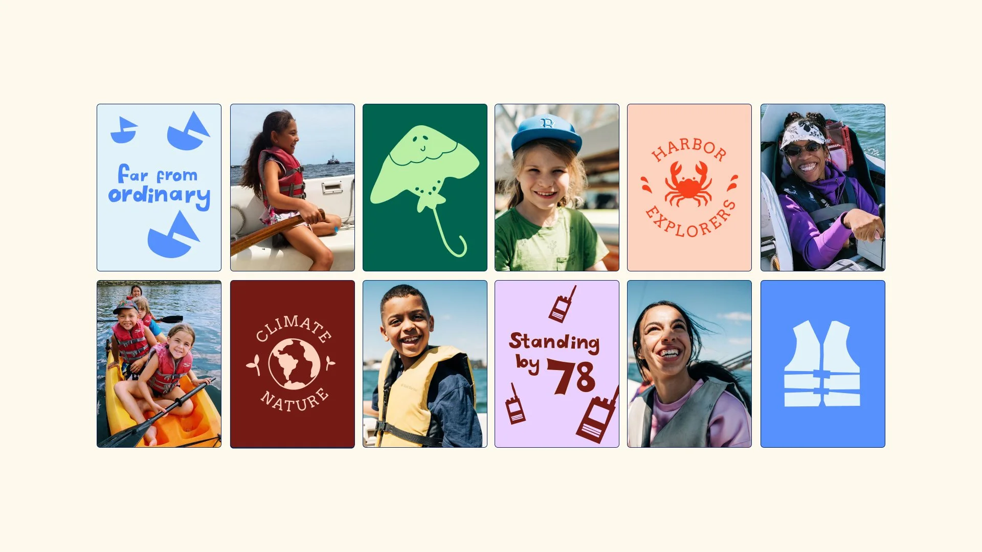
The young people and teen staff from the center created the custom fonts and the incredible artwork that bring the identity to life.

The challenge
Piers Park Sailing Center had evolved hugely over the years, but its brand hadn’t evolved with it. The existing identity and website felt dated, corporate and disconnected from the energy, warmth and sense of community that defines the organisation in real life.
The challenge was to create a brand that truly reflected who they are today - a welcoming, people-first sailing centre with a mission to empower people through accessible programmes and experiences on the water.
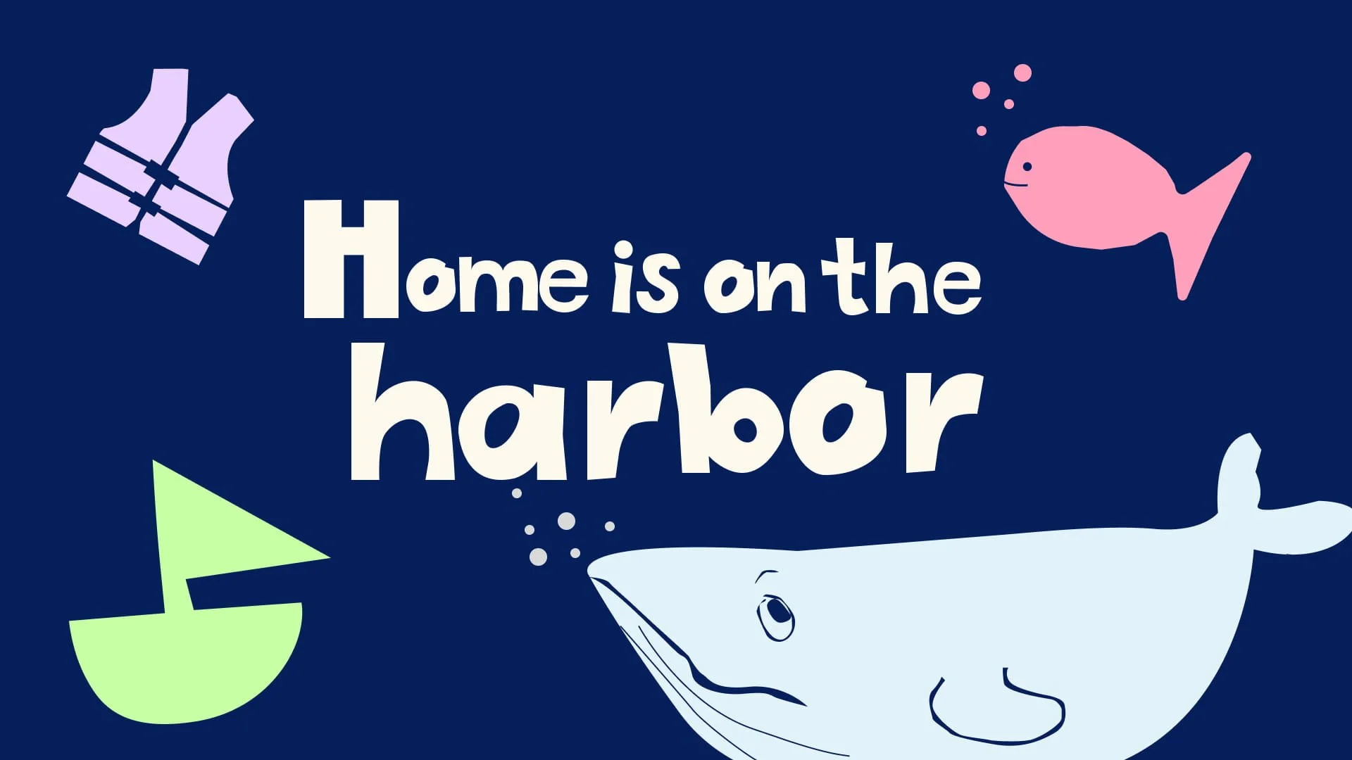
The concept
Home is on the Harbor is all about community, confidence and connection. Capturing the feeling of getting outside, trying something new and feeling welcome from the moment you arrive. Inspired by nostalgic summer camp energy, the concept brings warmth, playfulness and personality to the brand, creating a space that feels approachable, inclusive and full of life.

Built by the community
From the start, it was clear this couldn’t be a brand built for the community without involving them directly. Through workshops, young participants and teen staff at Piers Park Sailing Center helped shape the identity by creating custom typography and illustrations. Their creativity, humour and perspective brought an authenticity to the project that couldn’t have been replicated in isolation.


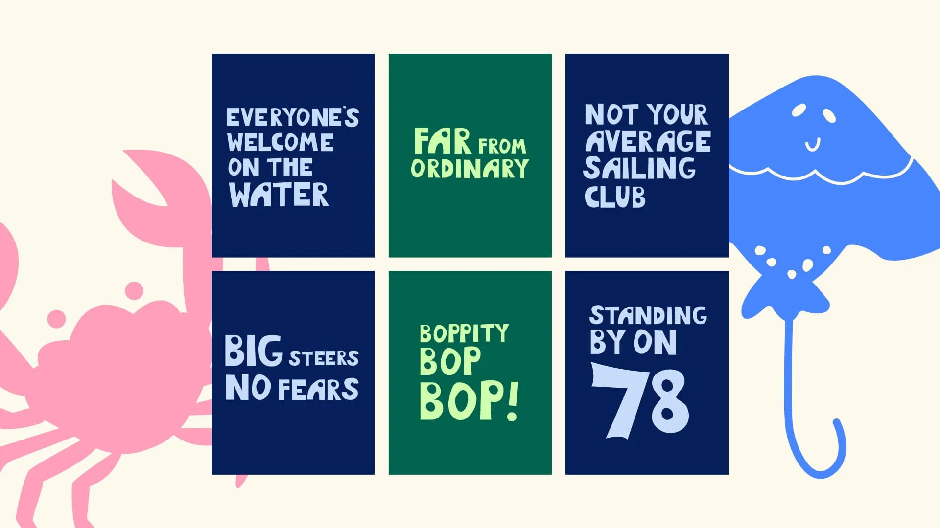
A voice that sounds like them!
The tone of voice was built in the same collaborative way, using the phrases, sailing slang and everyday language used by the community itself and the way participants and staff speak to each other both on and off the water. This helped create a voice that feels approachable, full of personality and genuinely reflective of the people behind the organisation.


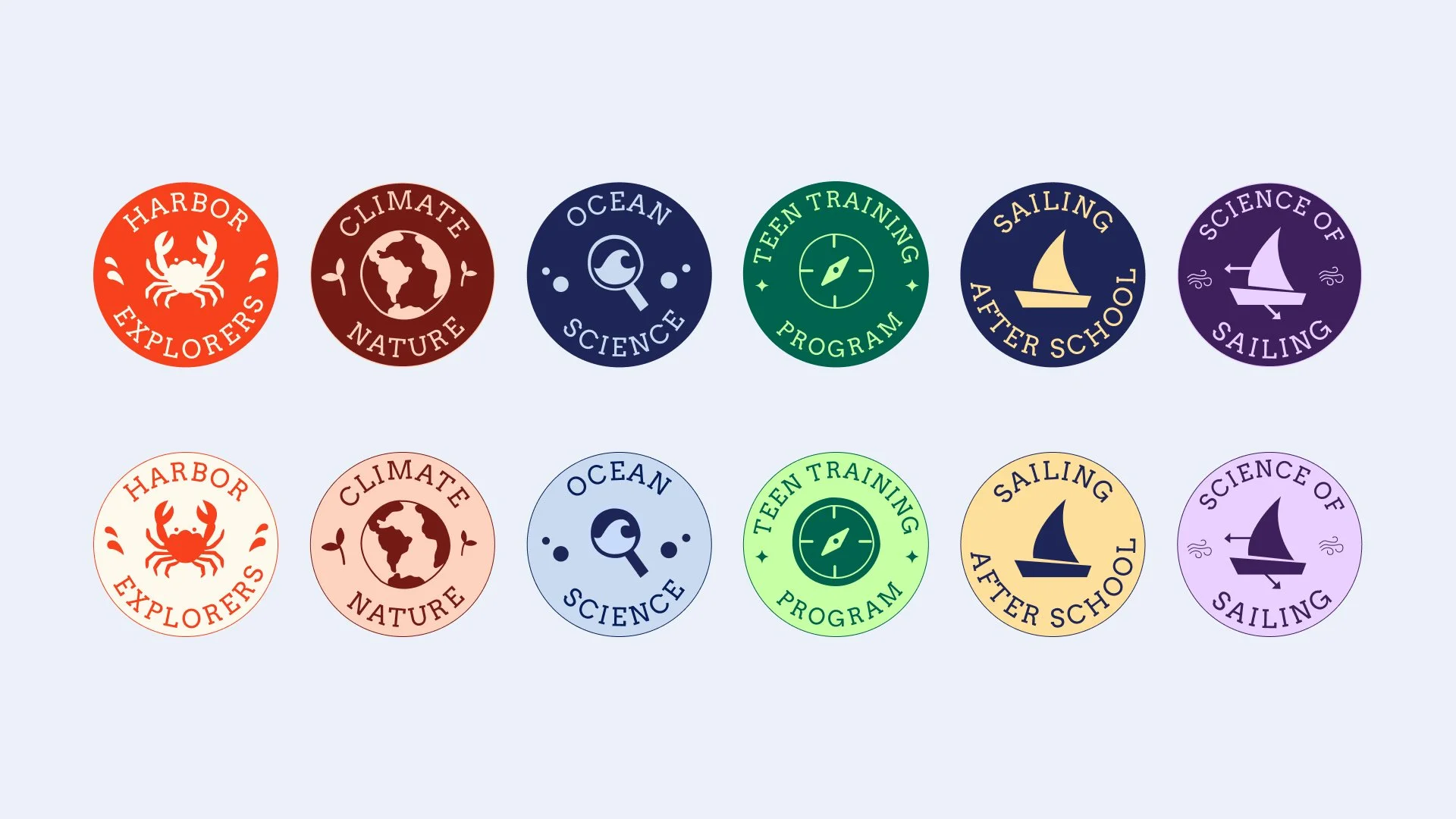
A new system of sailing badges brings consistency across the Piers Park Sailing Center programme while giving each course its own distinct identity. Designed to help differentiate the wide range of programmes — which previously felt visually similar — each badge draws on the character and spirit of the individual experience, from youth sailing to advanced training.

“To us the most important thing was that we look like who we are, and that has 100% been accomplished by this project. We are out in the world feeling confident because we look like our true selves.
We feel like we stand out big time. While other orgs have AI sloppy looking posters, we have original art, fresh, youthful, fun, and engaging that really makes people take notice and pay attention
Everyone that has seen our rebrand (our staff, our community, funders, partners) loves it and has been commenting on it.”


You might also like
-
![Loop business cards]()
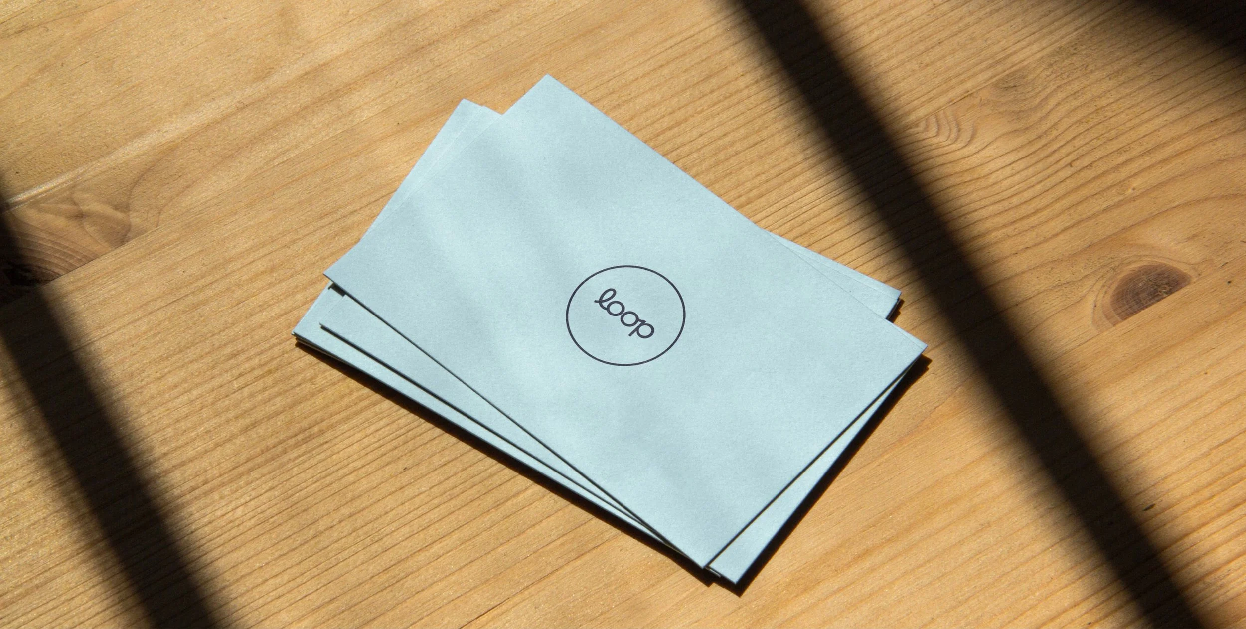
Loop Branding
A brand that’s here to make sense of heat pumps - what they do, why they matter, and how they can help us heat our homes more sustainably.
-
![An instagram story with a young woman looking really excited and text that says 'pop in sometime']()
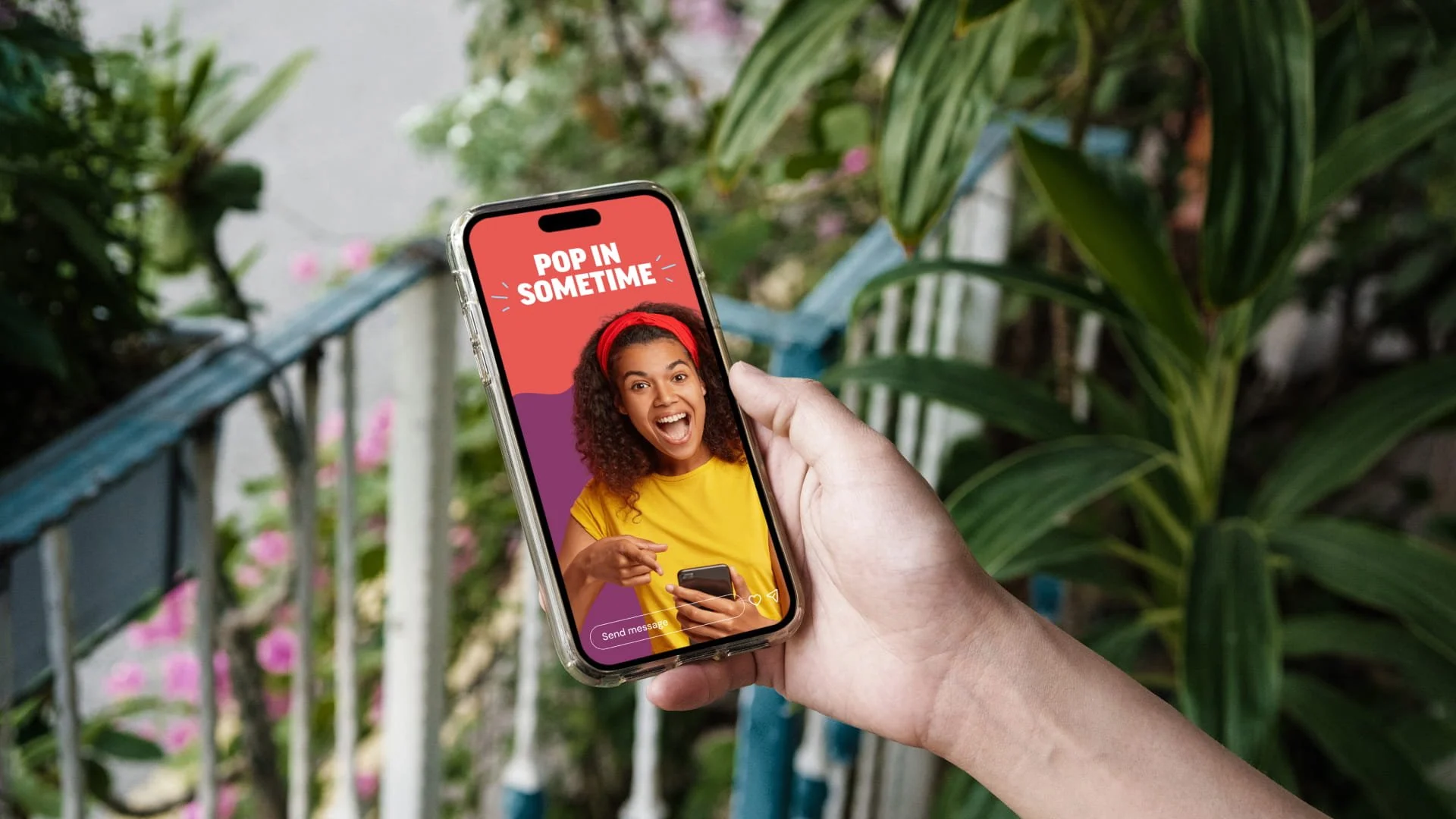
Suffolk Libraries
It all begins with an idea. Maybe you want to launch a business. Maybe you want to turn a hobby into something more.
-
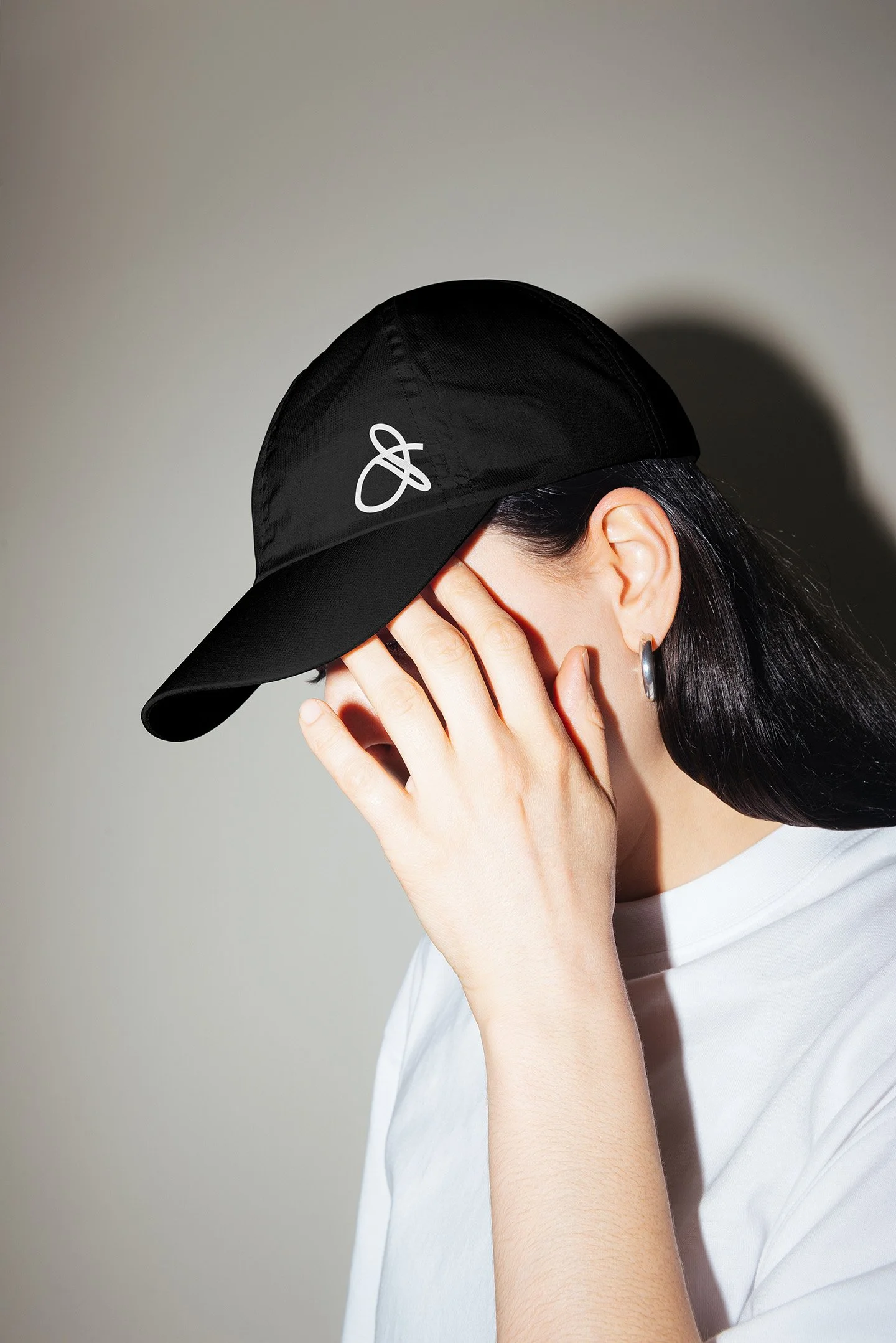
![A woman wearing a baseball cap with the Drift and Design logo printed on it]()
Drift & Design
A new visual identity inspired by what Drift & Design stands for: creative freedom, messy action and doing things on your own terms.
-
![The campaign logo on a black background with a green swipe of paint behind it]()
The Blank Page Project
A campaign for Suffolk Libraries inviting teenagers to explore their creativity through free workshops in writing, art and performance.
-
![the brand logo on a laptop screen being held up against a blue cloudy sky]()
Kinesthetica Coaching
Not your average coaching brand. Bold, unapologetic, and built to stand out, just like its founder, Amelia Saberwal.
-
![Examples of various website sections to show a new and improved user experience]()
Ashore
A fresh sub-brand to help Ashore speak directly to businesses. With a sharp identity and a new website experience that makes booking seamless, Ashore’s new offering is set to turn remote work into a treat for teams.
-
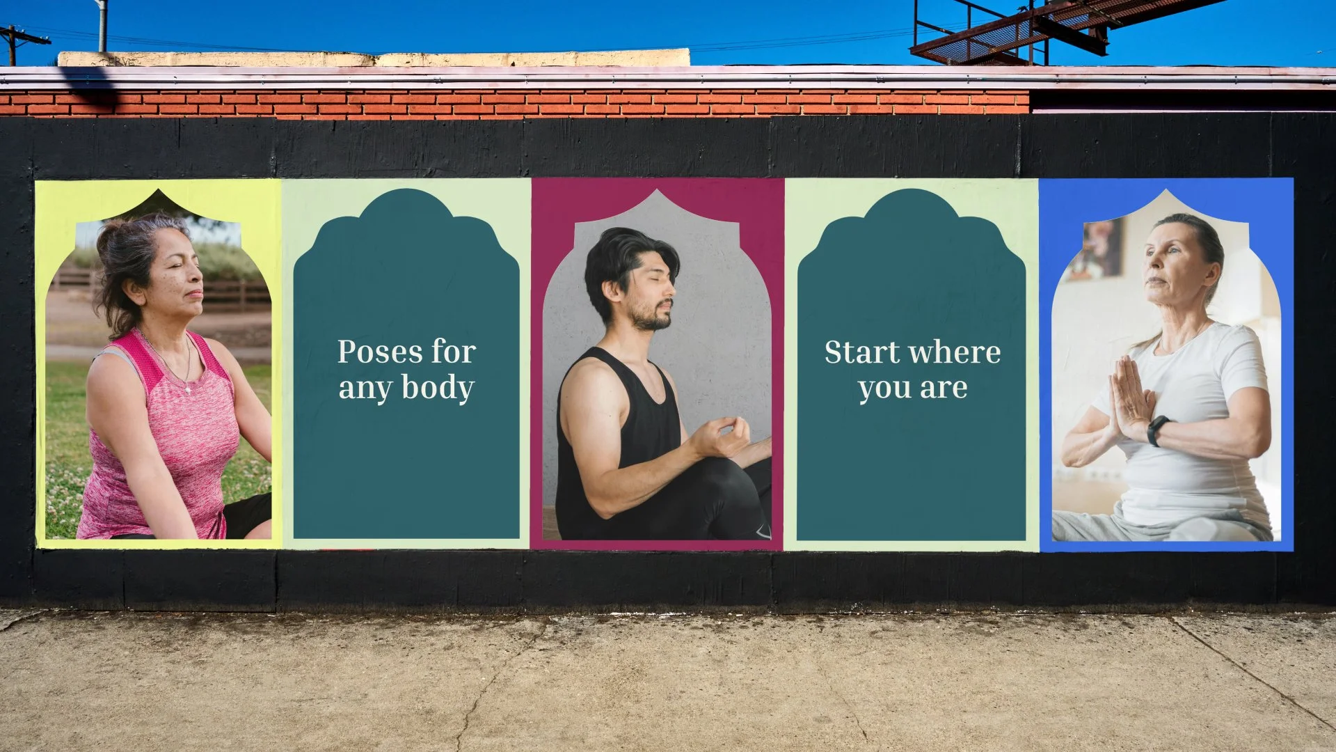
![A billboard with people doing yoga and text that says 'poses for any body' and 'start where you are']()
Finding Your New Normal
After surviving six strokes and a brain injury, Nikki understands what it means to rebuild life around a new reality. Finding Your New Normal was born from that experience