
Taylor Swift's Website Accessibility: 11 Mistakes Designers Should Avoid
Taylor Swift's new website has attracted plenty of attention, but from an accessibility perspective it highlights many of the same mistakes I see on business websites every day. Despite the huge budget behind the project, the site contains several issues that fall short of Web Content Accessibility Guidelines (WCAG), including low colour contrast, tiny text, decorative effects and poor HTML.
Colour and Typography Accessibility Issues
One of the biggest website accessibility problems I noticed was the site's use of colour and typography. These design choices might look visually striking, but they create unnecessary barriers for many users.
Low colour contrast
Orange text on a green background doesn't provide enough contrast, making it difficult to read for many people, particularly those with colour blindness or low vision. Around 1 in 12 men and 1 in 200 women have some form of colour vision deficiency, so colour combinations like this can make content almost impossible to distinguish.
Instead: Use high-contrast colour combinations, avoid relying on red and green together, and never use colour alone to communicate important information.
Glitter and glowing text effects
Glowing text, glitter effects and heavy visual styling can create a flickering appearance that may trigger migraines, visual stress or palinopsia. Decorative effects also reduce readability, especially when placed behind text.
Instead: Keep text clean and simple. Save decorative effects for backgrounds and avoid placing important content on top of them.
Font sizes that are too small
Small text forces people to zoom in or strain their eyes, particularly users with low vision, older adults and people reading on mobile devices.
Instead: Set body text to at least 16px and allow users to resize text without breaking the layout.
Hard-to-read typefaces
Narrow, condensed and uniform fonts make it difficult to distinguish individual letters, particularly for people with dyslexia, ADHD or low vision.
Instead: Choose accessible fonts with clear, distinctive letterforms and generous spacing.
Excessive use of capital letters
Writing everything in capitals makes words harder to recognise because they lose their natural shape. If coded incorrectly, screen readers may even read each letter individually instead of the word.
Instead: Use sentence case or title case wherever possible, and ensure your CSS preserves accessibility.
Centre-aligned body text
Long sections of centre-aligned text are much harder to scan because every line begins in a different position. This increases reading effort, particularly for people with dyslexia and cognitive disabilities.
Instead: Left-align body copy and reserve centred text for short headings or captions.
Italics used for body copy
Entire paragraphs in italics reduce readability, especially for people with dyslexia or low vision.
Instead: Use italics sparingly for emphasis rather than large blocks of text.
Drop shadows on text
Drop shadows might seem like a quick way to improve readability, but they often reduce text clarity instead. If text needs a shadow to stand out, the real problem is usually poor colour contrast or a busy background.
Instead: Improve the contrast between the text and its background rather than relying on decorative effects.
Website Navigation and Screen Reader Accessibility
Accessibility isn't only about visual design. Navigation, labels and semantic code all play a huge role in making websites usable for everyone.
Buttons that blend into the background
Buttons should look like buttons. When they blend into the surrounding design, users may not realise they're interactive.
Instead: Use high-contrast buttons with clear hover and keyboard focus states.
Icons without labels
Icons without text labels or accessible names can confuse sighted users and are often invisible to screen readers.
Instead: Add visible labels where appropriate and use ARIA labels for icons and SVGs so assistive technology can identify their purpose.
Missing alt text
Without alt text, screen readers can't describe images to people who are blind or have low vision.
Instead: Write concise, meaningful alt text that explains the purpose of the image. There's no need to begin with "Image of..." because screen readers already announce that it's an image.
Incorrect HTML structure
Improperly coded headings, buttons and forms make websites difficult to navigate using a keyboard or screen reader.
Instead: Use semantic HTML, including correctly nested H1, H2 and H3 headings, properly coded buttons and accessible form fields. If accessibility isn't your area of expertise, work with an experienced developer or accessibility specialist.
Here's a screenshot of the mobile version of the website highlighting several of these accessibility issues, including poor colour contrast, tiny text, decorative effects and difficult-to-read typography.
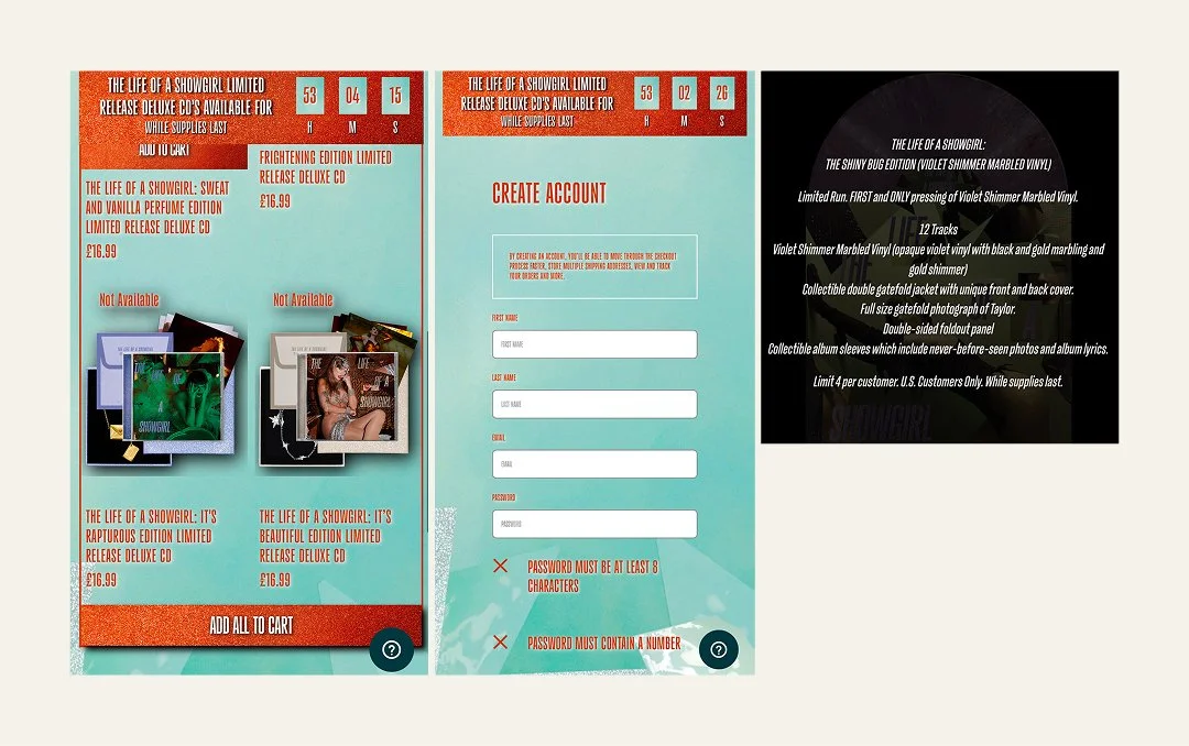
Image Description: Examples of the design choices that have resulted in poor accessibility, such as tiny fonts, drop shadows on text, glittery backgrounds and low contrast colour combinations.
An Accessibility Statement Isn't Enough
Taylor Swift's website includes an accessibility statement, but unfortunately it raises almost as many concerns as the website itself. It still references Internet Explorer, which was retired in 2022, and even misspells the word "accessibility".
More importantly, the statement directs users to a phone number if they experience accessibility problems. While offering support is positive, it shouldn't replace an accessible website.
Good website accessibility means people can browse, buy tickets and complete tasks independently, without needing to ask for help. When disabled users have to contact customer support simply to access content or complete a purchase, the website has already failed to meet its purpose.
Check Out My Brand Audit
Accessibility doesn't start with code – it starts with the decisions you make about your brand. From your colour palette and typography to your messaging, navigation and website design, small choices can have a big impact on how easy your business is to use.
My Brand Audit reviews your branding, website and user experience to uncover accessibility, usability and communication issues, with clear, practical recommendations to help you create a more inclusive experience.
Why Website Accessibility Matters
Website accessibility isn't just good practice – it's becoming a legal requirement in many parts of the world.
In the United States, several high-profile organisations have faced legal action over inaccessible websites, including Beyoncé's company after users who were blind were unable to access parts of her website. Across Europe, the European Accessibility Act is raising expectations around digital accessibility for many businesses and organisations.
While not every small business falls under the same legal requirements today, the direction of travel is clear. Accessibility is no longer considered a "nice to have". It's increasingly recognised as an essential part of good web design.
This isn't the first time accessibility has affected Taylor Swift fans either. During the Eras Tour, disabled fans reported barriers when trying to buy tickets because booking systems weren't fully accessible. It's another reminder that accessibility has real-world consequences, affecting whether people can participate independently in the experiences everyone else enjoys.
Accessibility Starts With Your Brand
One of the biggest misconceptions about website accessibility is that it's something developers fix at the end of a project.
In reality, accessible web design starts much earlier.
It begins with the decisions made during branding: colour palettes, typography, icons, imagery and the words we choose. Those decisions shape the entire design system and determine whether a website is inclusive by design or whether accessibility barriers are built in from the start.
As designers and developers, we have a responsibility to guide our clients towards accessible solutions. Most clients aren't accessibility experts, and they shouldn't have to be. They're trusting us to create websites that are functional, ethical and usable for everyone.
That's one of the reasons I'm critical of platforms like Showit. They're often marketed as an easy way to build beautiful websites, yet accessibility limitations are rarely part of the sales conversation.
Taylor Swift's website shows that accessibility isn't simply a budget problem. Even projects backed by enormous resources can overlook the fundamentals.
Ultimately, responsibility doesn't sit with one person. It belongs to designers, developers, agencies, business owners and anyone involved in creating digital experiences.
Accessibility isn't an optional extra or something to tick off at the end of a project. It should be the baseline for every website.
Further reading
If you'd like to learn more about creating accessible websites, these articles explore some of the topics covered in this review in more detail:
Website Animation Accessibility: How Motion Can Make Your Users Feel Sick. Learn how animations, parallax effects and scrolling movement can trigger dizziness, nausea and migraines, and discover how to create websites that are comfortable for everyone to use.
Alt text or image descriptions? Understand the difference between alt text and image descriptions, when to use each one and how to write meaningful image descriptions that work well for screen reader users.
Why "Click Here" Is Bad for Accessibility (And What to Use Instead). Discover why descriptive link text makes websites easier to navigate for screen reader users and improves usability for everyone.
10 Ways to Make Your Emails More Accessible. Accessibility doesn't stop at your website. Learn simple ways to make your marketing emails easier to read, navigate and interact with.
FAQs
-
An accessible website can be used by as many people as possible, including people with disabilities. This means using sufficient colour contrast, readable typography, descriptive alt text, keyboard-friendly navigation, semantic HTML and clear, consistent layouts. Following the Web Content Accessibility Guidelines (WCAG) helps ensure websites are usable for everyone.
-
Website accessibility allows people with disabilities to access information, complete tasks and navigate websites independently. It also improves the experience for many other users, including people using mobile devices, older adults and those with temporary injuries or situational limitations. In many countries, accessibility is also becoming a legal requirement.
-
Some of the most common accessibility issues include poor colour contrast, small font sizes, missing alt text, inaccessible buttons, incorrect HTML structure, missing form labels and relying on colour alone to communicate information. Many of these problems can be avoided by considering accessibility from the start of a project.
-
An accessibility statement explains how accessible a website is, any known limitations and how users can report accessibility issues. However, an accessibility statement should never replace an accessible website. The goal is for people to use your website independently, without needing to ask for assistance.
-
Both. Accessibility begins with brand decisions such as colour palettes, typography, icons and content, then continues through design and development with semantic HTML, keyboard navigation, ARIA labels and accessible code. The best results come when accessibility is considered throughout the entire project, not added at the end.