A (not so Swift) rant about Taylor…
I've got a BIG rant for you this week, about Taylor Swift's new website. A site this high-profile, with a huge design budget, backed by of one of the biggest record labels in the world, still bypasses accessibility standards.
Here's what I spotted (and how you can do better!):
→ Orange on green
These are 'complimentary' colours, meaning they're close to each other on the colour wheel and don't have much contrast between them. For people with colour blindness (1 in 12 men, 1 in 200 women) this combo could be almost indistinguishable.
Instead: Use high-contrast combinations, avoid using red and green together, and never rely on colour alone to convey meaning.
→ Glitter and glowing effects on text and buttons
These create a distorted fluttering effect that can trigger migraines or palinopsia.
Instead: Keep text styles simple and clean. Save decorative effects for backgrounds and avoid putting text over those backgrounds.
→ Buttons that blend into the background
They're not obviously clickable.
Instead: Use bold, high-contrast buttons with clear hover and focus states.
→ Icons without context or titles
Screen readers can't interpret them, and even sighted users may be confused.
Instead: Add text labels or titles into your design and make sure there are ARIA labels in the code of the website. An ARIA label is a piece of code or tag that tells screen readers what the thing is. Sometimes icons are loaded as images with alt text but if they're SVGs, they need to be labelled correctly.
→ Teenie tiny font sizes
These are far too small to read comfortably.
Instead: Set body copy at a minimum of 16px, and allow text to resize.
→ Narrow, uniform fonts
Letters are difficult to distinguish, especially for people with low vision or ADHD.
Instead: Use accessible typefaces with distinct letterforms.
→ All caps everything
Difficult to read as the letters all run into eachother and a nightmare for screen readers, unless the correct code has been used. If not, a screen reader will read out one letter at a time. Can you imagine?!
Instead: Use lower case and make sure the CSS (the code that styles letters) is correct.
→Center-aligned text everywhere
This is difficult to scan and track, particularly in long paragraphs.
Our eyes read more easily when lines start in a consistent place. Center alignment increases effort for dyslexic readers and anyone with cognitive differences.
Instead: Left-align body copy. Reserve centered text for short headings or captions.
→Italic paragraphs
Really hard to read!
Italics reduce clarity, especially for dyslexic readers or people with low vision.
Instead: Use italics sparingly for emphasis, never for full paragraphs.
→ Missing alt text
If there’s no alt text a screen reader can’t describe what the image is.
Instead: Add meaningful, concise alt text that explains the image content. You don't need to type 'An image of…' - a screen reader will announce that anyway.
→Incorrect HTML labelling
Headings, buttons, and forms are improperly coded, breaking keyboard navigation and screen reader functionality.
Instead: Use semantic HTML correctly (H1s, H2s, paragraphs, buttons, forms). Hire a pro developer, or even an accessibility specialist if needed.
Oh and there are drop shadows on everything. Never, ever use drop shadows on text. If you need to add a shadow to make something readable it means there's a fault somewhere else in your design that needs fixing.
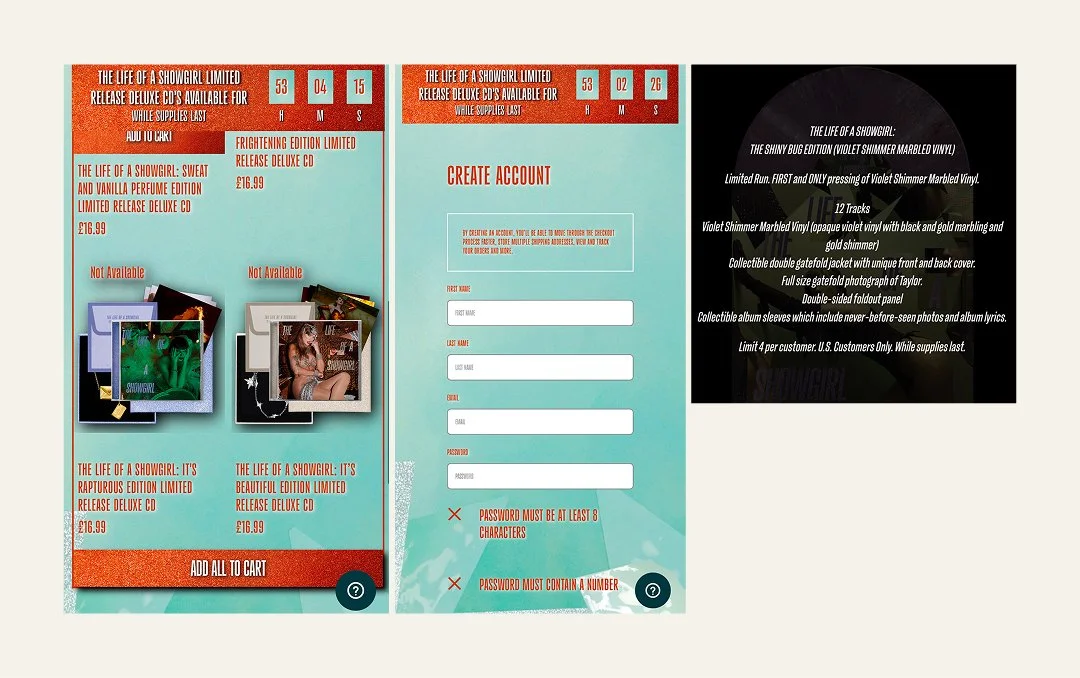
Here's a screenshot of the mobile site where you can see some of the thing's I've mentioned in action.
Image Description: Examples of the design choices that have resulted in poor accessibility, such as tiny fonts, drop shadows on text, glittery backgrounds and low contrast colour combinations.
And then there's the so-called accessibility statement. It references Internet Explorer (retired in 2022) and it even misspells ‘accessibility’.
The site provides a phone number for accessibility problems, but this approach treats accessibility as an afterthought or help desk issue. What happens when you phone that number is a disaster, too.
Too often, users with disabilities face barriers and must reach out for assistance, rather than navigating independently. None of this is acceptable. Accessibility is about ensuring people can use can have independence and be included.
Beyoncé was sued for these same issues on her website. In the US and now the EU its illegal to have a website that doesn't comply with guidelines. Ok, small businesses might not be affected but the precedent is there and who knows if that'll change in the future?
Disabled fans couldn't buy Eras Tour tickets because booking systems weren't accessible. We've been here before, and it just goes to show there's still so much work to be done around accessibility.
Closing comments:
Accessibility doesn't start with the web build. It starts with brand elements - colour palettes, typography, icons, and copy. These choices filter down into the design system and either build inclusion or bake in barriers.
Designers, developers - listen up. Clients hire us to do good work. They don't always know what accessibility is or why it matters. It's partly on us to make sure what we build is functional, ethical, and usable for everyone.
That's why I always call out platforms like Showit. They're inherently inaccessible, yet sold on to clients who are none the wiser.
Then we've got Taylor Swift's new website. A billionaire and a record label with huge resources and still, basic accessibility is ignored.
So whose fault is it? Taylor's? Her management? The design team?
Responsibility sits with all of us. Designers, developers, service providers, small business owners, the LOT.
Accessibility doesn't belong at the bottom of a to-do list, it's the baseline.
Ciao for now,
Lauren

